Working with graphs in Microsoft Excel is a great way to understand your data, but sometimes the default scale doesn’t show the information clearly. Maybe the numbers look too small, too big, or the chart feels crowded. The good news is, you can easily change the scale on an Excel graph to make it more readable and accurate. In this blog, we’ll explain in simple steps how to adjust the scale, so your charts display data exactly the way you want.
🛠 Step-by-Step: Change Axis Scale in Excel
Step 1: Select the Chart and Axis
- Click on your chart to activate the Chart Tools (Design and Format tabs).
- Then select the axis you want to change (for example the value axis). Or use the Chart Elements dropdown: Chart Tools → Format tab → Current Selection → Chart Elements → Vertical (Value) Axis.
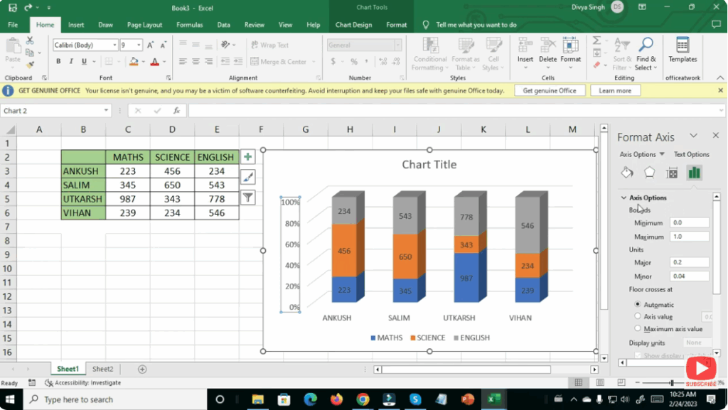
Step 2: Open the Format Axis Pane
- With the axis selected, right-click and choose Format Axis…
- Alternatively go to: Format tab → Format Selection.
- The Format Axis pane appears on the right with Axis Options.
Step 3: Adjust Bounds (Minimum / Maximum)
- In the Axis Options section of the Format Axis pane:
- Under Bounds, enter your desired values for Minimum and Maximum.
- For example, if all your data points lie between 60 and 90, you could set Minimum to 50 and Maximum to 100 for better distribution.
- Press Enter and observe the axis update.
Step 4: Adjust Major and Minor Units
- Also in Axis Options: Under Units, set the Major unit (distance between major tick marks) and optionally the Minor unit.
- For example, changing from 100 000 increments to 50 000 increments makes the scale finer.
Step 5: (Optional) Use Logarithmic Scale or Display Units
- If your data spans several orders of magnitude (e.g., 10 to 10 000), you can select Logarithmic scale. Note: this cannot be used if there are zero or negative values.
- You can also set Display units to thousands, millions etc., so that large numbers are shown more clearly.
Step 6: Review and Fine-Tune
- After applying changes, check the chart:
- Are the axis labels clear?
- Is the data visually well distributed and readable?
- Are tick marks and labels spaced appropriately?
- If not, go back and tweak bounds, units or axis type.
✅ Summary
Changing the scale of an axis in Excel is a powerful way to customise your charts for clarity and better data representation. By selecting the axis, opening the Format Axis pane, and adjusting bounds, units or scale type you can tailor a chart to suit your data and audience. With these steps, your Excel graphs will look cleaner, more accurate and more impactful.