#DataVisualization
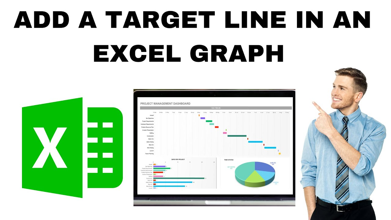
How to Add a Target Line in an Excel Graph (Target Line Graph)
Adding a target line to an Excel graph helps you visually compare actual data against goals, benchmarks, or averages, making performance tracking clear at...

How to Change Chart Style in Excel?
Changing the chart style in Excel helps make your data look more attractive and easier to understand. Excel offers many built-in styles you can...
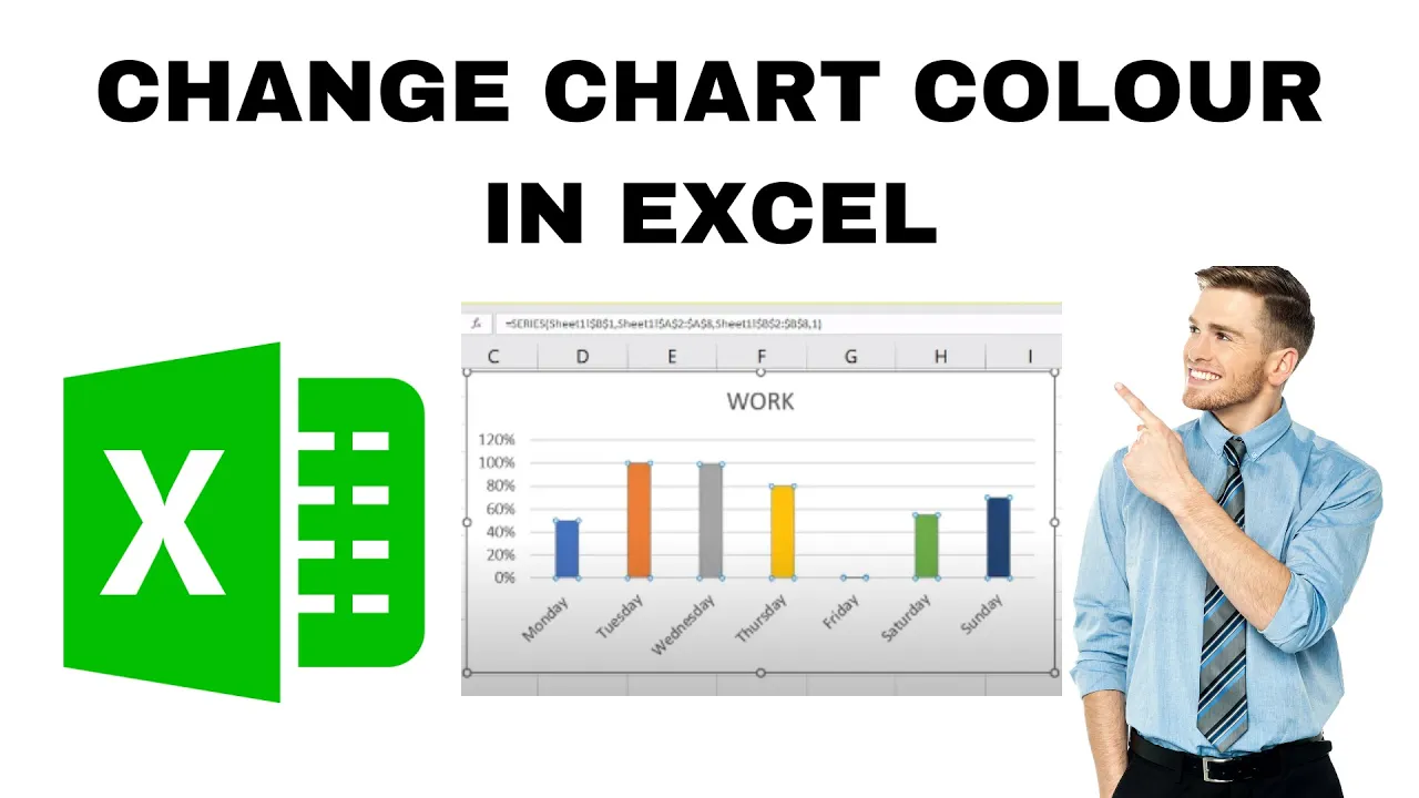
How to Change Chart Colour in Excel? Individual Bar Color
When you create a chart in Microsoft Excel, it often uses default colors that may not look the way you want. Sometimes you might...
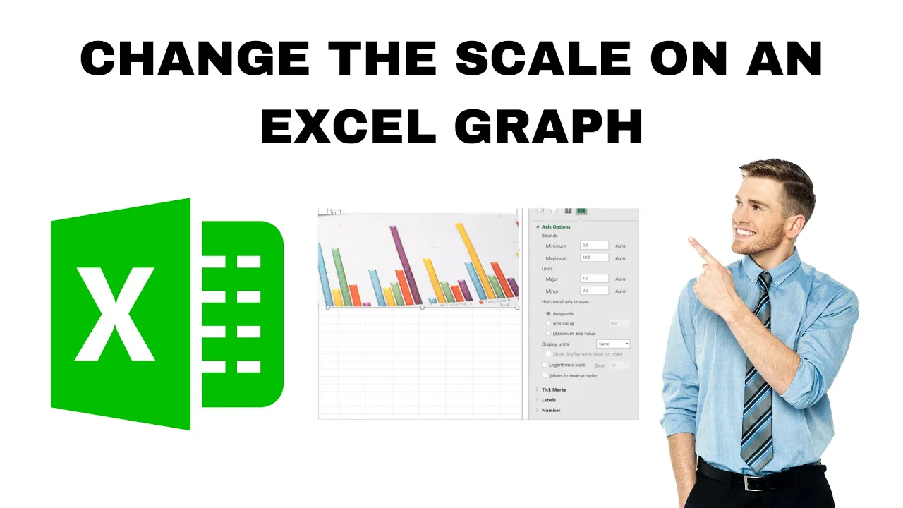
How to Change the Scale on an Excel Graph?
Working with graphs in Microsoft Excel is a great way to understand your data, but sometimes the default scale doesn’t show the information clearly....
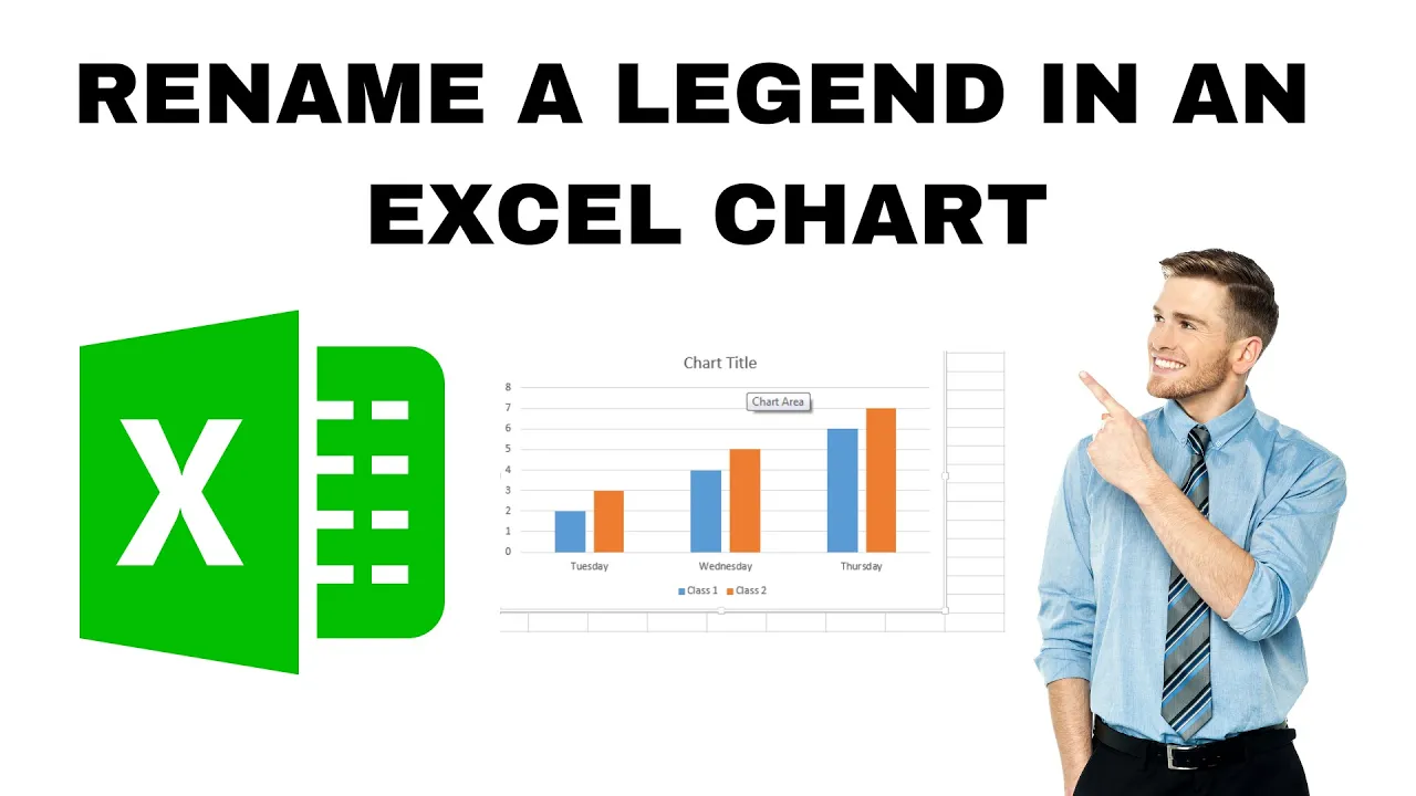
How to Rename a Legend in an Excel Chart? 2 Ways !!
Want to make your Excel chart look clearer and more professional? Renaming the legend is a great way to help others understand your data...