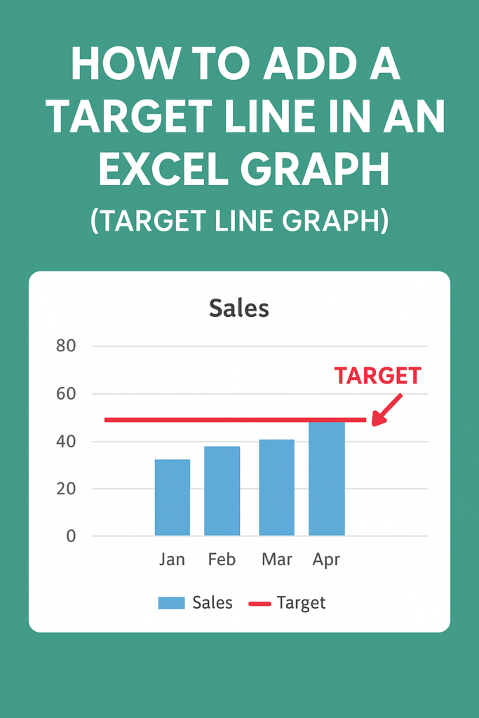
Adding a target line to an Excel graph helps you visually compare actual data against goals, benchmarks, or averages, making performance tracking clear at a glance. This technique works for bar, column, or line charts by adding a secondary data series and changing its type to a line. In this blog, you’ll learn easy step-by-step methods to insert, format, and customize target lines using combo charts for professional-looking graphs.
Step-by-Step: Add a Target Line in an Excel Graph
Follow these simple steps to insert a target line into your Excel chart.
Step 1: Prepare Your Data
Before adding a target line, you must organize your data properly.
Your dataset should contain:
- Actual values (like monthly sales)
- A target value (same value repeated across months)
Example:
| Month | Sales | Target |
|---|---|---|
| Jan | 45 | 60 |
| Feb | 55 | 60 |
| Mar | 52 | 60 |
| Apr | 65 | 60 |
💡 The Target column must have the same value in each row.
Step 2: Insert Your Chart
- Select the Sales and Target columns.
- Go to Insert → Charts → Line or Column Chart.
- Excel will generate a chart containing both datasets.
Step 3: Convert the Target Line into a Straight Line
Excel may show the Target column as bars in a bar chart.
To display it as a clean horizontal line:
- Click on the Target column in the chart.
- Right-click → Change Series Chart Type.
- Choose Line Chart for the Target series.
- Click OK.
Now the target line will appear clearly across the chart.
Step 4: Format the Target Line (Optional but Recommended)
To make the target line visually stronger:
- Right-click on the Target line.
- Select Format Data Series.
- Increase Line Width.
- Change the color to Red, Black, or any bold color.
- Choose Solid Line for best visibility.
Step 5: Final Adjustments
- Add data labels (optional)
- Change the chart title
- Adjust line style for clarity
Your Target Line Graph is now ready!
Conclusion
Adding a target line in Excel is simple and extremely useful for performance analysis. Whether you’re monitoring business KPIs or personal goals, a target line brings clarity and makes your chart more meaningful.