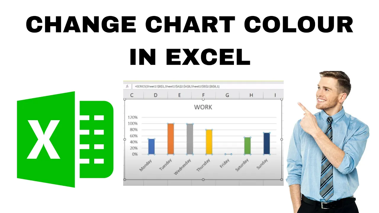
When you create a chart in Microsoft Excel, it often uses default colors that may not look the way you want. Sometimes you might want to highlight certain data by giving each bar or column a different color. The good news is, Excel makes it easy to change chart colors, including customizing the color of individual bars. In this blog, we’ll show you step by step how to change chart colors in Excel on Windows, so your charts look clearer, more professional, and easier to understand.
Step 1: Open Your Excel File and Insert a Chart
- Open your Excel workbook and select the dataset you want to visualize.
- Go to the Insert tab on the ribbon.
- Choose your preferred chart type — for example, Column Chart, Bar Chart, or Pie Chart.
- Your chart will appear in the Excel sheet automatically.
Step 2: Select a Data Series or Bar
- Click once on any bar in your chart — this selects the entire data series.
- To change the color of a single bar, click on that specific bar one more time.
- Now, only that individual bar will be highlighted.
Step 3: Change the Color of the Selected Bar
- With the bar selected, right-click and choose Format Data Point.
- In the Format Pane (usually on the right side of Excel), select the Fill & Line (paint bucket) icon.
- Choose Solid Fill.
- Click the color box and select your desired color from the palette — or choose More Colors for custom shades.
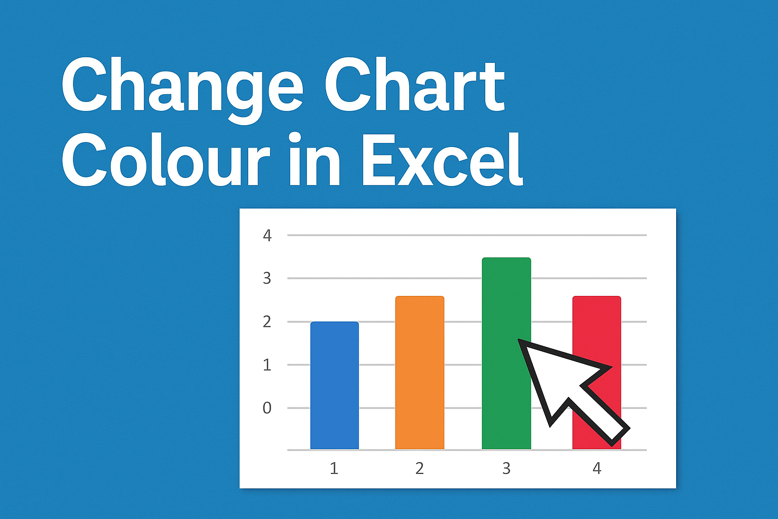
Step 4: Apply Different Colors to Multiple Bars
If you want each bar to have its own color:
- Click anywhere on the chart to select it.
- Right-click and choose Format Data Series.
- Under Fill, check the box Vary colors by point.
- Excel will automatically assign different colors to each bar in your chart.
Step 5: Save and Customize Your Chart Further
You can also:
- Add Data Labels for better readability.
- Adjust chart background or axis labels.
- Save your customized chart as a template for future use.
Conclusion
Customizing the color of individual bars in Excel is a quick way to make your charts stand out. Whether you’re preparing a business presentation or academic report, highlighting data with distinct colors can make your message more powerful and professional.