
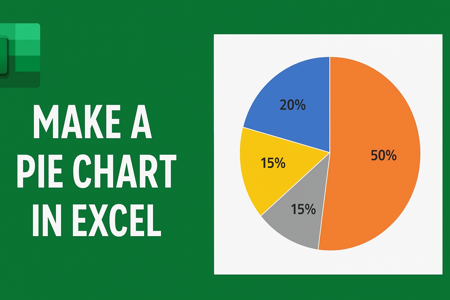
Making a pie chart in Excel is an easy way to show how different parts make up a whole using colorful slices. Pie charts help you quickly understand data like budgets, survey results, or sales percentages. In this blog, you’ll learn simple step-by-step instructions to select your data, insert a pie chart, customize colors and labels, and make your information clear and eye-catching for presentations or reports.
🛠️ Step-by-Step: How to Create a Pie Chart in Excel
1. Prepare Your Data
Your data should be organized in a simple two-column layout:
| Category | Value |
|---|---|
| Category A | 40 |
| Category B | 25 |
| Category C | 20 |
| Category D | 15 |
- Column A: Category labels / names
- Column B: Numeric values / amounts
- No empty rows — blank rows can confuse Excel’s chart function
2. Select the Data Range
- Click and drag to highlight the cells containing both the categories and their values.
- Alternatively, click any cell within the data range if your data is contiguous.
3. Insert the Pie Chart
- Go to the Insert tab on the Excel ribbon.
- In the Charts group, click the Pie Chart icon.
- From the dropdown, choose the pie chart style you want (2-D Pie, 3-D Pie, Doughnut, etc.).
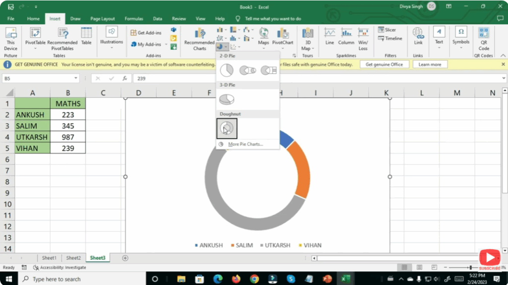
Excel will instantly create a pie chart based on your selected data.
4. Add / Enable Data Labels (Values or Percentages)
To help viewers understand exact proportions:
- Click the chart.
- Click the green + icon (Chart Elements) next to the chart.
- Check Data Labels.
- Optionally, click the arrow next to Data Labels → choose More Options → select Percentage (or Value + %).
This shows each slice’s share as a percentage — very useful for clarity.
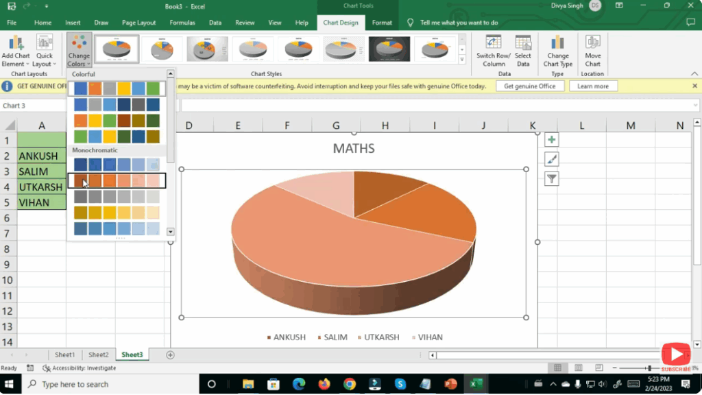
5. Customize Chart Design & Style
- Use the Chart Design and Format tabs to adjust chart appearance.
- Change colors: pick a consistent color scheme matching your presentation or brand.
- Explode slices (optional): pull out one slice to highlight a key category.
- Add chart title: click the default title to write something meaningful (e.g. “Budget Distribution 2025”).
6. Sort Data for Largest-to-Smallest Slices (Better Visual Order)
If you want slices ordered (largest first, then descending):
- Sort your data range by the Value column in descending order before inserting the chart.
- This makes the pie chart visually more intuitive (largest slice starts at 12 o’clock, next in clockwise order).