Changing the chart style in Excel helps make your data look more attractive and easier to understand. Excel offers many built-in styles you can apply with just a click to change colors, shapes, and effects on your charts. In this blog, you’ll learn simple step-by-step ways to select your chart and quickly change its style to make your presentations and reports look professional and visually appealing.
✅ Step-by-Step: How to Change Chart Style in Excel
1. Create or Select Your Chart
- If you haven’t already: select your data and insert a chart (Insert → Charts → choose chart type — e.g. Column, Pie, Bar, Line, etc.).
- If you already have a chart, simply click on it — this will activate the “Chart Design” and “Format” tabs on the ribbon.
2. Open the Chart Design Tab
- With the chart selected, go to the Chart Design tab (sometimes labeled just “Design” depending on version).
- In this tab you’ll see a group called Chart Styles — a gallery showing various pre-defined styles.
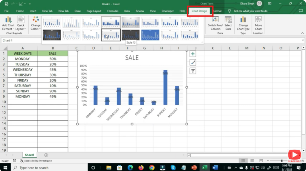
3. Choose a Style from the Gallery
- In the Chart Styles gallery — scroll through and hover over a style to preview how your chart will look.
- Click on the style you like — it will apply immediately to your chart, changing colors, background, border, and overall layout.
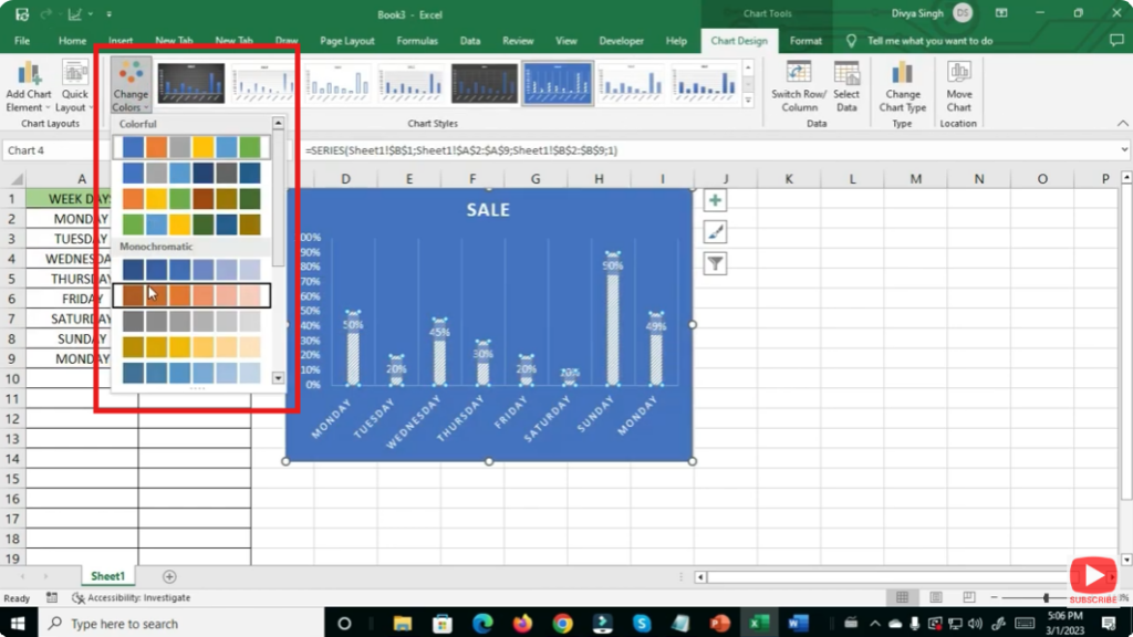
4. Try Different Style Variants (Color and Layout)
- Some chart styles have variants (light background, dark background, different color palettes).
- Click on the small drop-down or “More” arrow at the bottom-right of the gallery to see all options.
- Choose the variant that best matches your data’s look and readability needs.
5. Customize Further via Format and Design Tools
If the gallery styles don’t exactly match what you need — you can customize further:
- Use Format tab to change individual elements: series color, axis, labels, gridlines, background, borders.
- Use Add Chart Element (in Design tab) to add/remove titles, data labels, legend, gridlines, data table.
- Right-click on parts (bars, pie slices, lines) to format with more control (fill, border, effects)
This gives you full control — from overall look to minute details.