Adding a trendline in an Excel graph is a simple way to see patterns in your data. It helps you understand whether numbers are going up, down, or staying steady over time. Trendlines are often used in charts to make data easier to read, especially for sales reports, performance tracking, or project analysis. The good news is, Excel has a built-in option to add a trendline with just a few clicks. In this beginner-friendly blog, we’ll explain in easy language how to add a trendline in an Excel graph step by step, so you can make your charts more meaningful.

🛠️ Step-by-Step: Add a Trendline in Excel
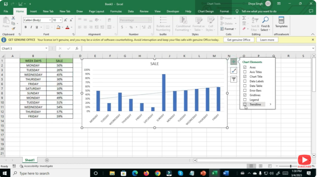
- Prepare your data and create a chart
- Make sure your data is organized — e.g. with independent variable (like dates or X values) in one column and dependent variable (like sales, values) in another.
- Insert a chart: often scatter plots or line charts work best to show trends.
- Select the chart/data series
- Click anywhere on your chart to select it.
- If using a scatter or line chart, click on one of the data points. Right-clicking on a data point helps ensure Excel knows which data series you want to apply the trendline to.
- Add the Trendline
- Either click the “+” Chart Elements button that appears next to the chart (in newer versions of Excel) and check “Trendline.”
- Or right-click on the data series (bars, points or lines depending on chart type) and choose “Add Trendline…” from the context menu.
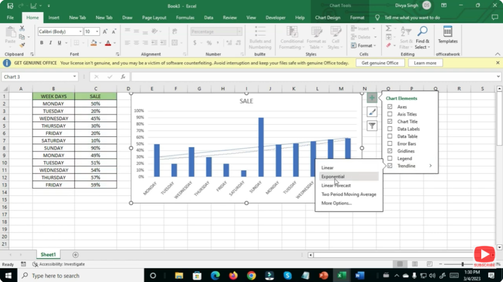
- Choose the type of trendline
- In the “Trendline Options” (or “Format Trendline” pane), you can choose among types: Linear, Exponential, Logarithmic, Polynomial, Moving Average, etc. The most common is Linear.
- Choose the option that best fits the nature of your data/trend.
- Optional: Display equation and R² value
- If you want to show the mathematical equation or the R-squared value (measure of fit), check the box “Display Equation on chart” or “Display R-squared value on chart.”
- This is useful when you want to use the trendline for forecasting or quantitative analysis.
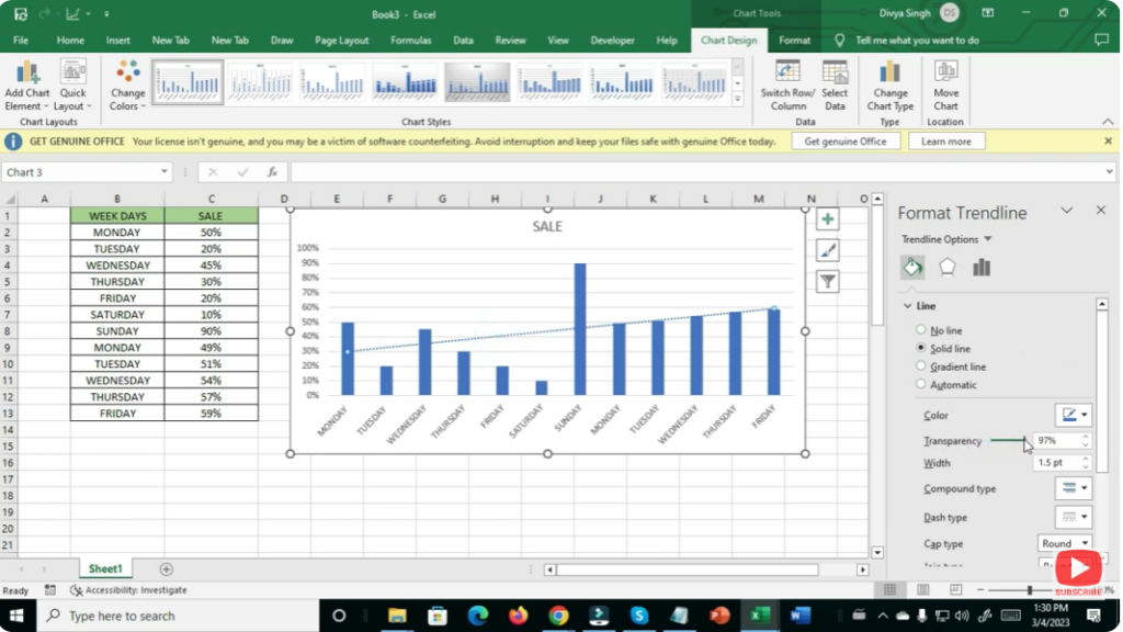
- Format the Trendline (optional)
- Customize the look: change color, thickness, style — anything to make the trendline stand out or integrate nicely with your chart.
- Adjust chart titles, axis labels, legends to ensure clarity.
- Finalize your chart
- Review your chart: make sure the data and trendline correctly reflect what you want to show.
- Save your workbook. Your chart now both shows raw data and highlights the overall trend.
✨ Final Thoughts
Adding a trendline in Excel transforms a simple chart into a data-driven narrative: rather than just showing individual points, you highlight the story — growth, decline, stability, or pattern — hidden in the data. Once you master adding and formatting trendlines, you’ll significantly improve the readability and professionalism of your charts for reports, presentations, or analyses.